
SANYO ECO-i Campaign
HVAC ECO-i Multi-Zone Campaign
SANYO Commercial Solutions, one of nine departments within SANYO North America, has been a leader in the HVAC industry for over 20 years, delivering innovative, space-efficient, and eco-friendly conditioning solutions tailored to modern business needs.
As Creative Director, I was challenged to develop a captivating campaign for a product designed to be discreet—whether hidden in a closet or placed out of sight on a rooftop. I transformed this otherwise unremarkable product into a visually engaging, thought-provoking narrative that not only showcased its flexibility but also communicated its value in a compelling and impactful way.

SCOPE OF WORK
Creative Strategy & Concept Development
Brand Identity & Messaging
Design & Collateral Development
Trade Show Experience & Execution
Digital & Print Media
CHALLENGE
Turning an unappealing, hidden HVAC product into a visually engaging concept, working within strict SANYO brand guidelines, and maintaining a cohesive, creative theme across all materials. Additionally, it required aligning the sales team’s trade show presence with the medical-inspired campaign to make a lasting impact.
OUTCOME
The campaign revitalized the product’s image, enhanced brand visibility, and increased engagement at trade shows, while effectively positioning ECO-i as a vital solution for buildings.
Strategy
I spearheaded a comprehensive rebranding of SANYO's HVAC department, building it from the ground up. This involved crafting a cohesive strategy that seamlessly integrated design, messaging, and visual identity. By creating an extensive suite of collateral materials, I ensured that every touchpoint reinforced the campaign’s core message, resulting in a powerful and unified brand presence.
DEVELOPING IDEAS
To craft a compelling campaign for SANYO’s experienced HVAC department, I assembled a small team to brainstorm creative concepts. We began with rough sketches and storyboarding, working through ideas to find the most engaging visual approach that could bring energy to a typically unremarkable product.
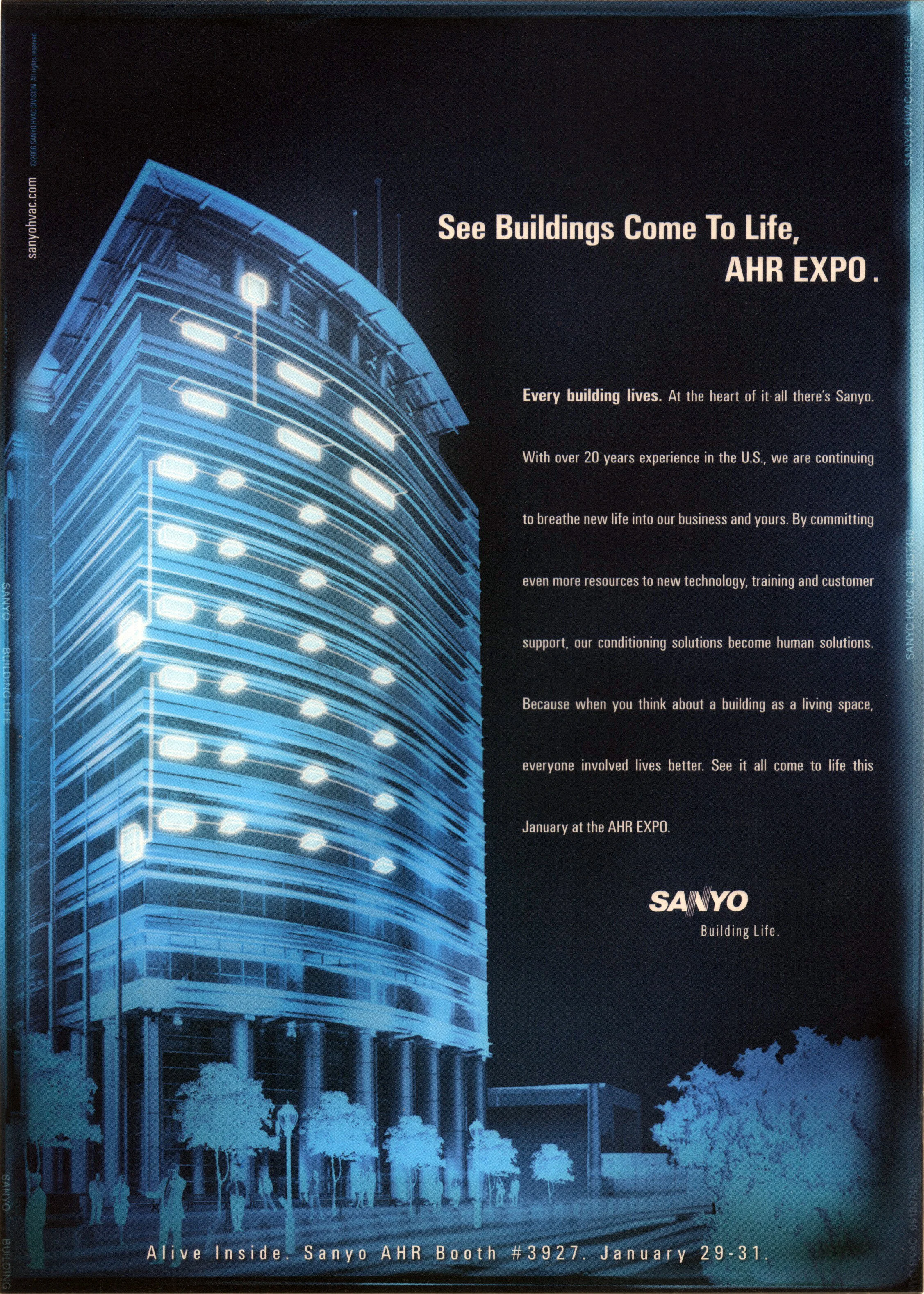
During our kickoff discovery session with the executive team, I pitched the concept that the ECO-i Conditioning system "breathes life" into the buildings it inhabits—turning structures into living, dynamic spaces. This idea became the foundation of the campaign, illustrating how the product revitalizes the environments it serves.


Approval of the Concept
We extended the concept even further by developing multiple slogans, each designed to explore different facets of the product’s potential and maximize its impact; this allowed us to experiment with a variety of messaging angles before honing in on the most effective approach. In addition to the slogans, we carefully selected colors and fonts to build a cohesive brand identity system, ensuring that all elements worked in harmony to create a sense of unity, consistency, and adaptability. Although we were heavily constrained by the existing SANYO style guide, which imposed strict limitations on the use of color and visuals, we were able to push the boundaries as far as possible, infusing vibrancy and creativity while remaining within the established guidelines.

Bold Colors

Bold Slogans

Bold Results
Concept Expanded
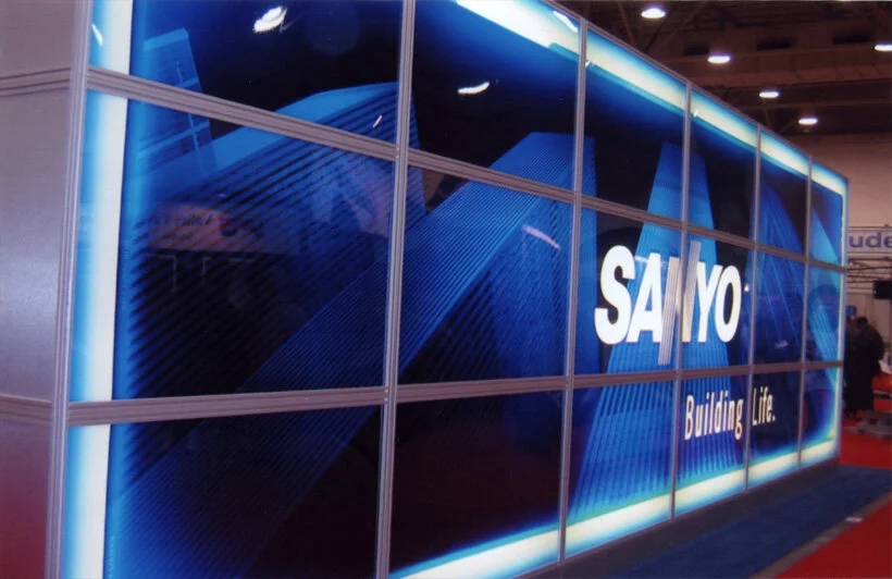
We expanded the concept by introducing the idea that the ECO-i system "breathes life into buildings." This metaphor transformed our installers, trainers, and support staff into medical professionals performing a kind of surgery to revive structures. To reinforce this, we developed x-ray-style flyers that depicted the ECO-i system as the heart, pumping life into buildings. These flyers became standout giveaways at trade shows, effectively drawing attention to the product.
At the trade shows, we took the theme even further by having the entire sales team dress as physicians, complete with lab coats, thermometers, and stethoscopes, fully committing to the creative vision and leaving a lasting impression on attendees.

Concept Continued.
TRI-FOLD BROCHURE
To maintain consistency with the creative theme across all collateral, we designed a tri-fold brochure that mimics a hospital file folder. This unique approach reinforced the campaign’s medical-inspired concept while offering a practical and memorable piece for potential clients.
BROCHURE
The 42-page brochure tells a compelling story of how our complete line of conditioning solutions revitalizes and brings life to every structure they serve.